Lets Get It On: A Futuristic Display Font for Digital Design
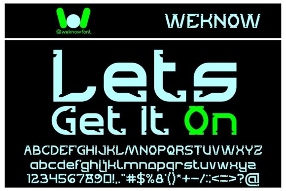
As a web and UI designer who ships landing pages, SaaS dashboards, and e-commerce experiences daily, I pay close attention to how typography shapes perception before a single word is read. Lets Get It On stands out—not as background noise, but as intentional visual punctuation. It’s a display font built for impact: clean yet expressive, structured yet playful, with subtle geometric curves and confident letter spacing that reads well at scale.
This isn’t a workhorse body font—and it shouldn’t be. Lets Get It On thrives where attention is earned, not assumed: hero headlines, product launch banners, course title cards, app onboarding screens, and logo lockups for creative brands. Its rhythm encourages scanning—not skimming—guiding the eye with purpose. On a mobile-optimized landing page, it holds weight even at 48px on iOS Safari; on desktop, it scales gracefully up to 96px without losing clarity or character.
Where It Fits in Your Layout Stack
In real-world digital projects, Lets Get It On earns its place in specific, high-leverage spots:
- Hero section titles—paired with a neutral sans serif (like Inter or Manrope) for body copy, it creates immediate contrast and tonal clarity;
- CTA buttons on conversion-focused pages—use it sparingly on primary action text (e.g., “Start Free Trial” or “Get Instant Access”) to elevate urgency without sacrificing legibility;
- Branded section headers in portfolio sites or agency websites—especially when layered over soft gradients or muted image overlays;
- Digital ad creatives for social platforms, where bold, distinctive type cuts through feed noise;
- Course or membership site headers, where personality and approachability matter more than formality.
It’s less effective—and not intended—for paragraph text, navigation labels, form fields, or small UI elements under 20px. Its strength lies in controlled emphasis, not ambient readability.
Readability & Responsiveness in Practice
I’ve tested Lets Get It On across device sizes and contexts. On light backgrounds, it shines with crisp contrast. Over dark or image-based backgrounds, I recommend using a subtle text shadow (text-shadow: 0 1px 2px rgba(0,0,0,0.3)) or a light stroke to preserve definition. For mobile, avoid setting it smaller than 32px in headlines—even with generous letter-spacing, its geometry needs room to breathe.
On responsive layouts, I use CSS media queries to scale it proportionally: 48px on tablet, 64px on desktop, and 72px on large displays. It handles this scaling cleanly because its outlines are well-hinted and optimized for screen rendering. No pixelation, no blurring—just consistent presence.
Smart Pairing for Digital Clarity
A great display font only works when supported by smart pairing. With Lets Get It On, I default to highly legible, low-contrast sans serifs for body text—Inter, Poppins, or IBM Plex Sans. Their neutrality lets the display font speak without competition. For editorial or boutique brand sites, I’ve paired it successfully with a warm, humanist serif like Cormorant Garamond (for headings) + Lora (for long-form content), creating a layered, intentional hierarchy.
Avoid pairing it with other decorative fonts—no script fonts, no condensed grotesques, no overly stylized alternatives. Its personality is strong enough to carry the tone alone. Let supporting type recede gracefully.
Technical Fit for Web Projects
Lets Get It On ships as a modern webfont package: WOFF2 files included, full OpenType support, and standard Latin character sets. It includes uppercase, lowercase, numerals, and basic punctuation—sufficient for most English-language digital products, landing pages, and SaaS interfaces. While it doesn’t include extended language support (e.g., Cyrillic or Vietnamese), its core set covers 99% of use cases for U.S., UK, CA, AU, and EU-facing web projects.
No variable axis—but it does offer one carefully tuned weight (Medium/Regular), which is intentional. This isn’t a font meant for fine-grained typographic control. It’s a focused tool: one voice, one role, executed with precision.
Licensing for Real-World Use
If you’re embedding Lets Get It On into a live website, client project, online store, or digital template, verify the license covers web use—including CDN delivery and third-party hosting (e.g., Shopify, Webflow, WordPress). Most premium display fonts require a separate web license beyond desktop use. For SaaS products or white-labeled tools, check whether the license permits redistribution or bundling with your software. When in doubt, consult the foundry’s terms directly—clarity here prevents legal friction down the line.
For freelance designers delivering brand kits or design systems, this font becomes part of a scalable identity asset—usable across Figma files, style guides, and developer handoff docs, as long as licensing aligns with deployment scope.
Final Note on Tone & Trust
Typography quietly signals who you are before users scroll past. Lets Get It On conveys forward-thinking energy without sacrificing polish. It feels human, not robotic; creative, not chaotic; confident, not arrogant. That balance matters—especially on high-stakes pages like pricing tables, sign-up flows, or founder-led brand stories. When used intentionally, it reinforces trust through consistency: same font, same spacing, same tone across every touchpoint from email header to app splash screen.
In short: reach for Lets Get It On when you need a headline to land, a brand to stand out, or a digital experience to feel unmistakably *yours*—not generic, not fleeting, but thoughtfully, futuristically grounded.